Main Menu
As the first step of Buc-ee’s web redesign, we dove into understanding the challenges of the current site so we could adopt strategic solutions in our design. The primary goal of the Buc-ee’s team was to modernize the site with an updated look and feel. We wanted the website to serve as a seamless experience from the store to the digital space, so we knew the design would need to emulate the busy, fun energy of the store.
The big question: How do you bring the excitement and spontaneity of a road trip to the digital landscape?
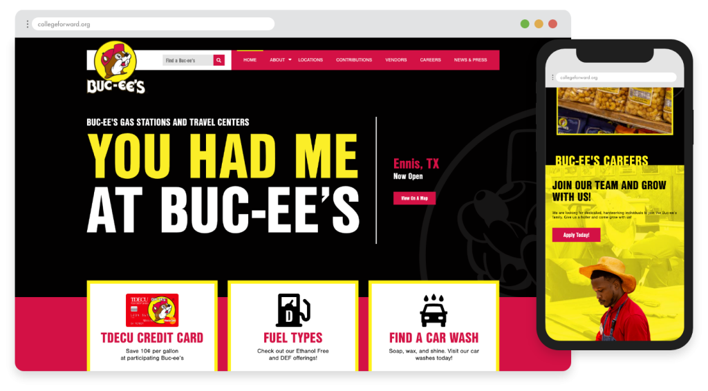
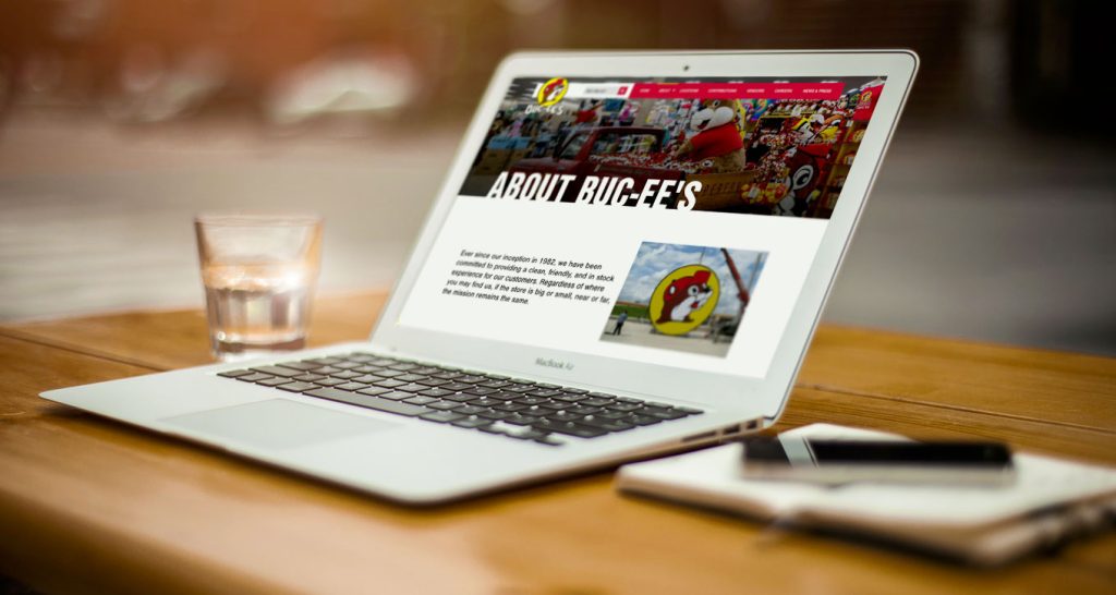
Our design team was excited by the challenge of representing an established brand in a fresh, modernized way. With so much stock in its witty and catchy messaging, we knew our best inspiration for design would be found in the popular Buc-ee’s billboards found along Texas highways. We based the site’s color scheme on the color palette found in the brand’s logo: black, red, yellow, and white. While the logo additionally utilizes a traditional, woody brown for Buc-ee himself, we shifted the site’s emphasis to sleek blacks for a more sophisticated, trendy look.
To recreate the bold, buzzing experience from the stores to the digital landscape, we added animations, parallax motion, and edgy fonts. We also incorporated fun car graphics to represent roadtrip vibes, with dotted lines that imitate a road, bring movement to the page, and guide the user’s eye to important elements. Throughout the overall design for the site, we kept in mind one main theme: fun.
Each step of our design and development was informed by a purpose-driven approach…
By intertwining innovative design with Buc-ee’s long-standing brand equity, we were able to extend the same in-store energy to the online space, maintaining the exciting, world-class Buc-ee’s experience for all customers.
Within the first month after launch, Buc-ee’s saw hundreds of thousands of visitors to its new site, including the primary audience of users who are now able to easily and quickly find store locations. The new site also equipped the brand with a detailed and clear careers page to inform prospective employees about a career path with Buc-ee’s. Saving time and frustration for team members managing the site, the Elementor Page Builder has made it possible for nontechnical staff to make changes and updates as needed.
Overall, the fun, friendly vibe of the Buc-ee’s brand is now equally represented in both the digital and physical space. Though an in-person visit to a Buc-ee’s store will forever be unparalleled, the digital experience offers any type of visitor a small piece of the zesty, beloved Buc-ee flavor.